Tap
Brand identity redesign for an industrial automation and smart engineering platform.

Isometric triad & open systems
TAP engineers hardware controllers and automation software architectures for complex industrial manufacturing facilities.
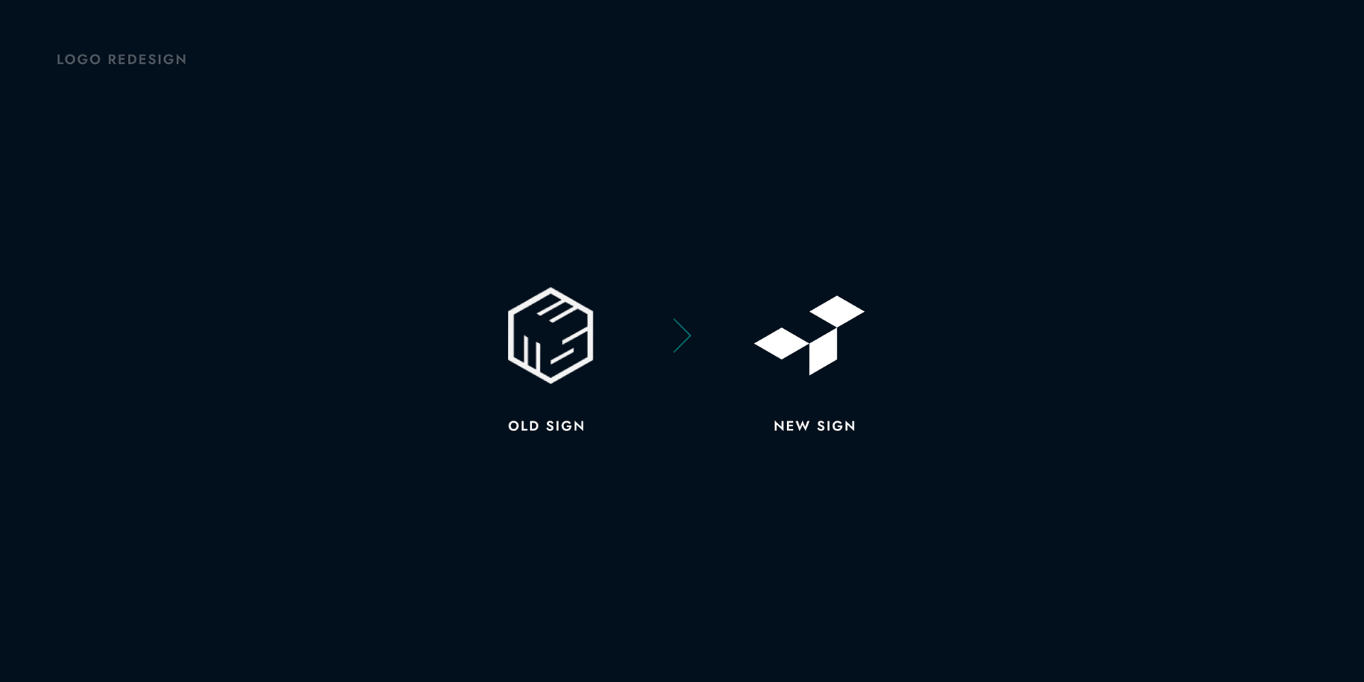
Replacing a dated closed-cube emblem, the redesign introduces a dynamic triad of isometric rhombuses, symbolizing modular hardware architecture and open data throughput.
Three dynamic rhombuses that evolve the static box into an open symbol of directional flow and automation logic.
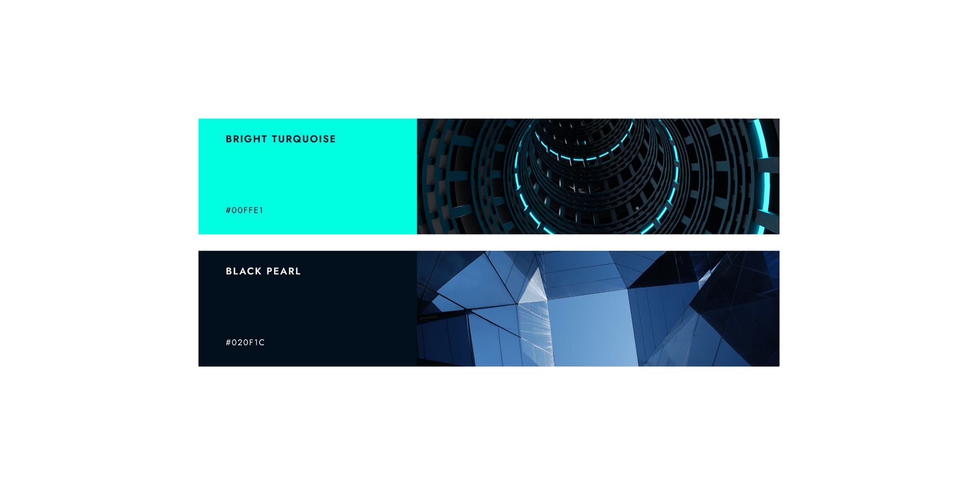
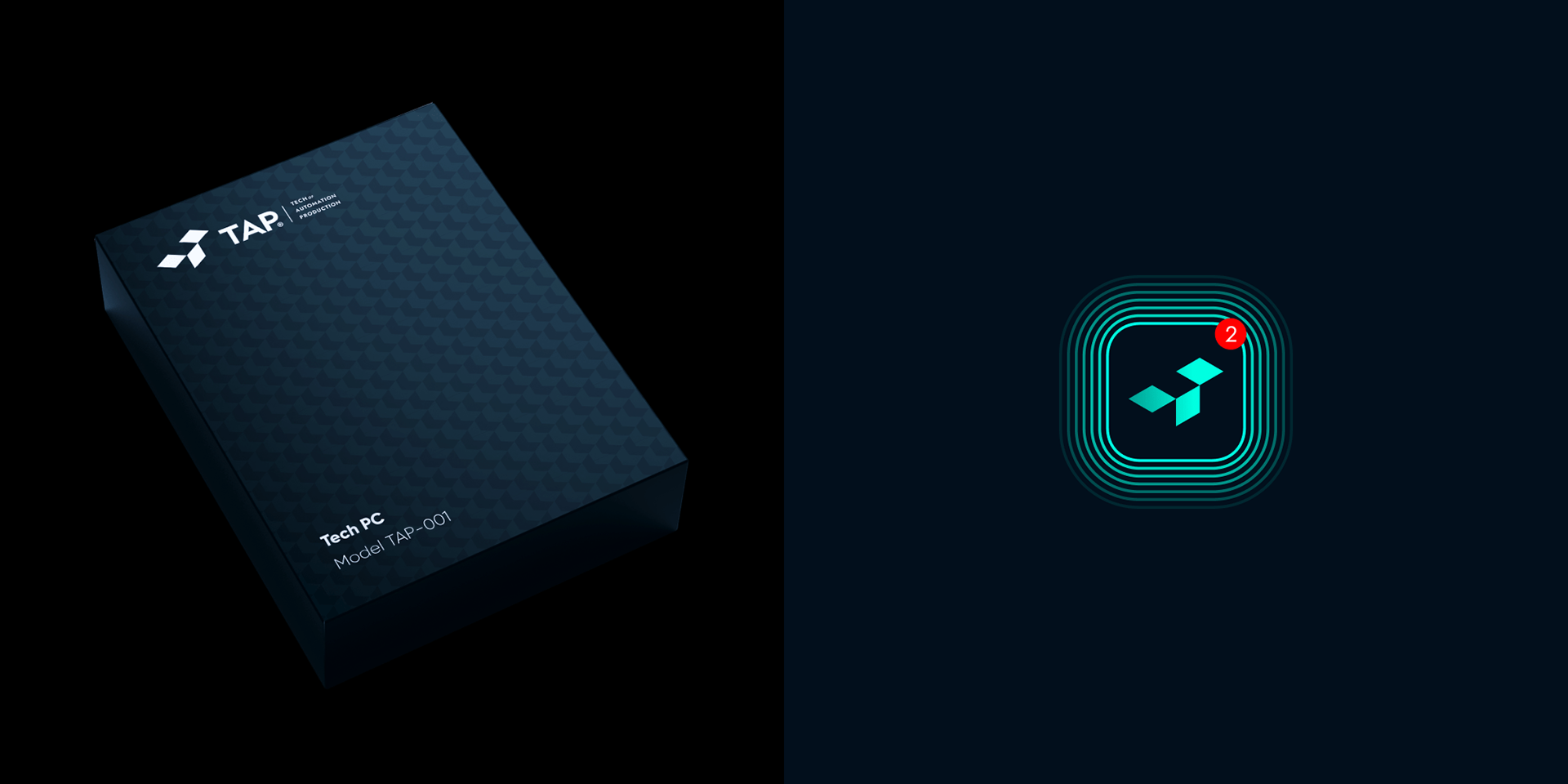
High-visibility Bright Turquoise against deep Black Pearl navy for technical monitoring and server rack visibility.
Geometric rules optimized for metal stamping, PCB enclosures, technical schematics, and operator consoles.
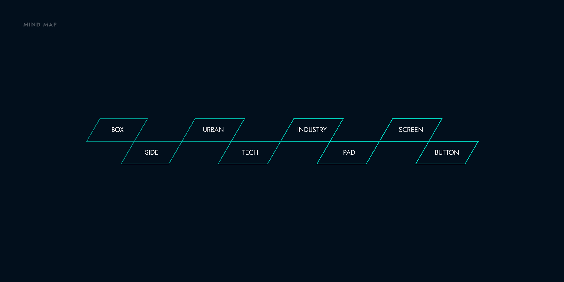
From closed box to open flow
The redesign deconstructs the traditional packaging cube into an isometric matrix. Three directional rhombuses convey movement, speed, and precision while maintaining instant legibility at microscopic scales on industrial equipment.



Electric turquoise and geometric Jost
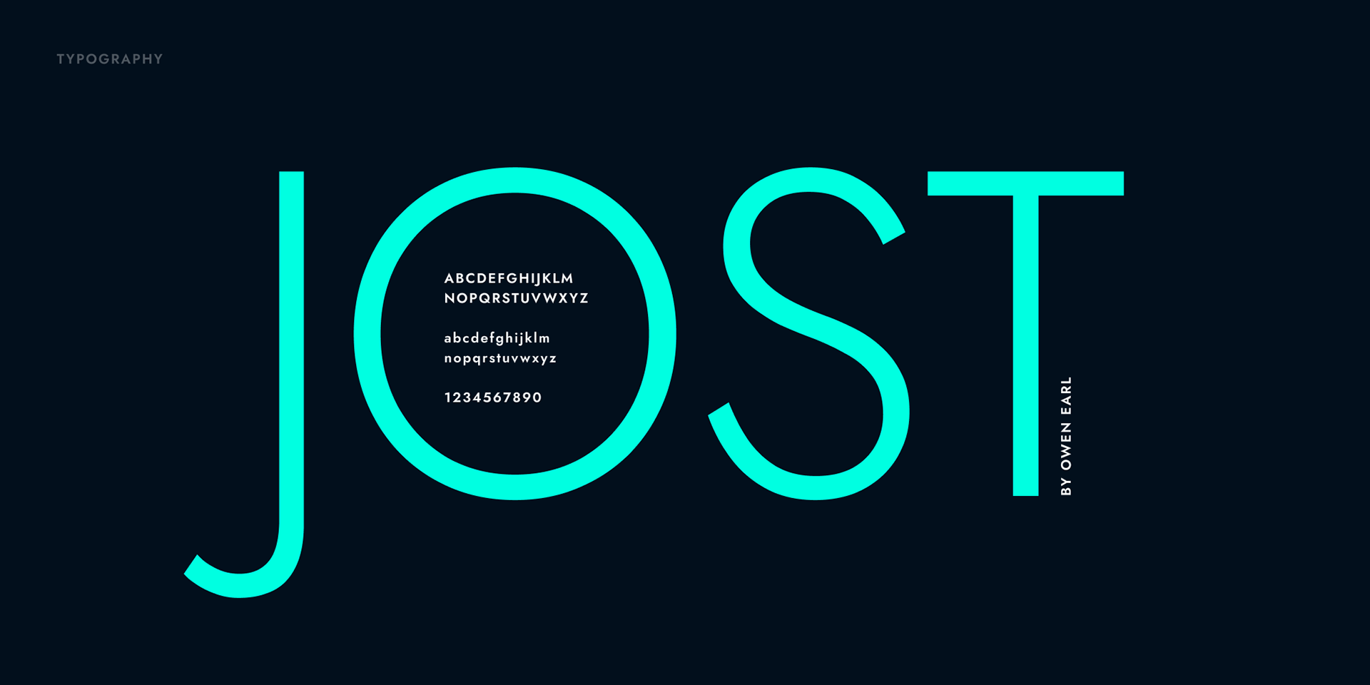
Bright Turquoise (#00FFE0) paired with inky Black Pearl (#020F1C) delivers surgical contrast across operator dashboards, accompanied by the clean geometric grotesque Jost by Owen Earl.
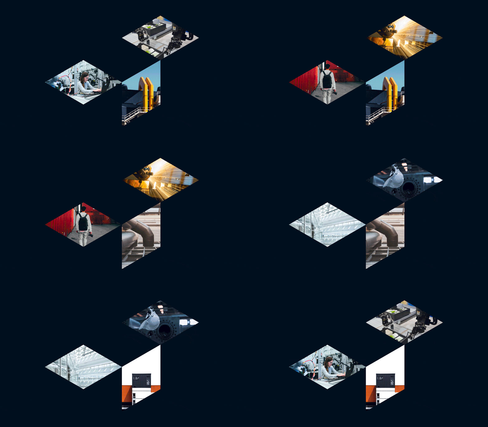
Isometric matrices and modular graphics
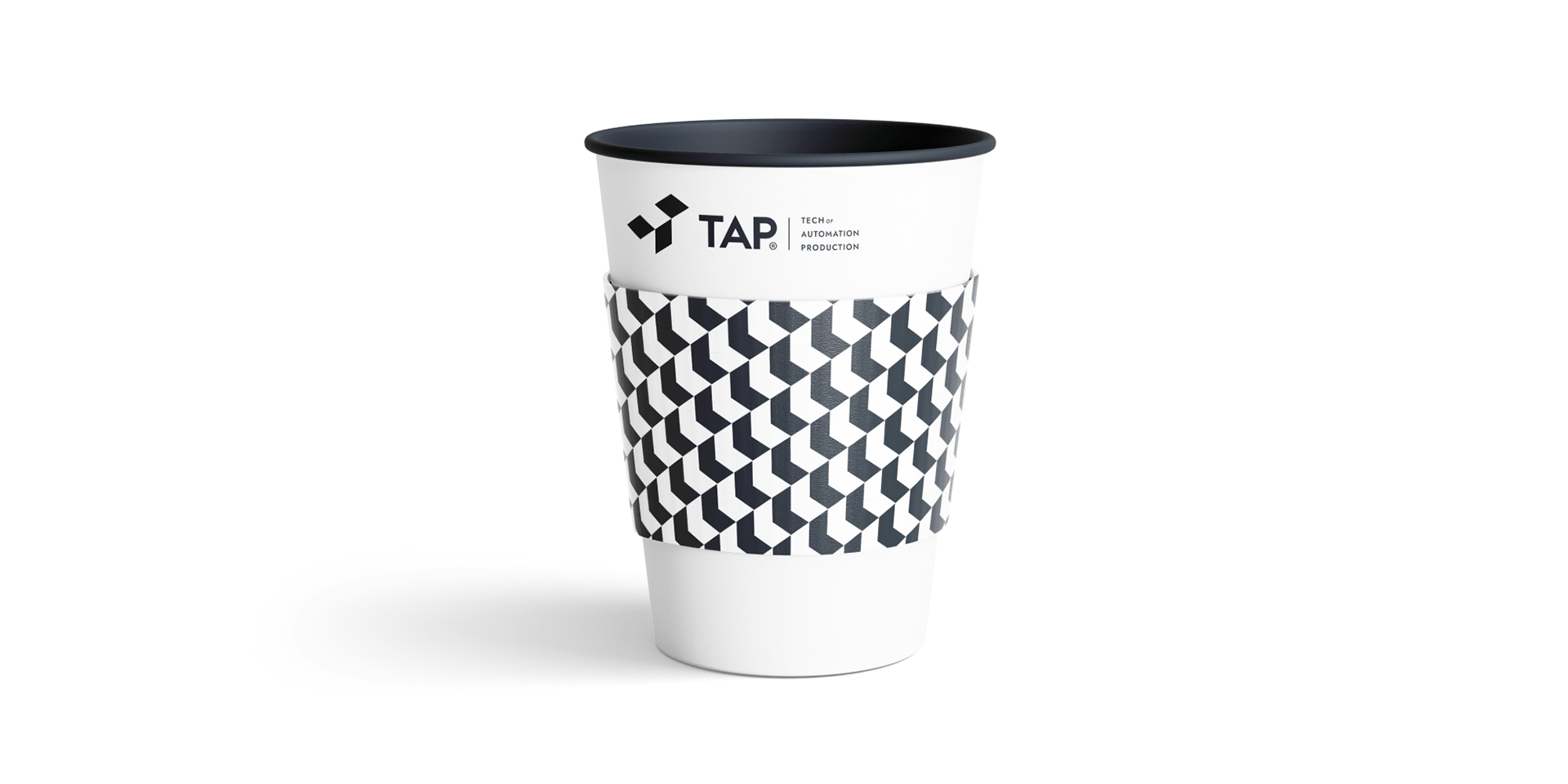
Isometric rhombuses form a versatile modular language, acting as containers for factory floor footage, digital process monitoring badges, and corporate communication patterns.

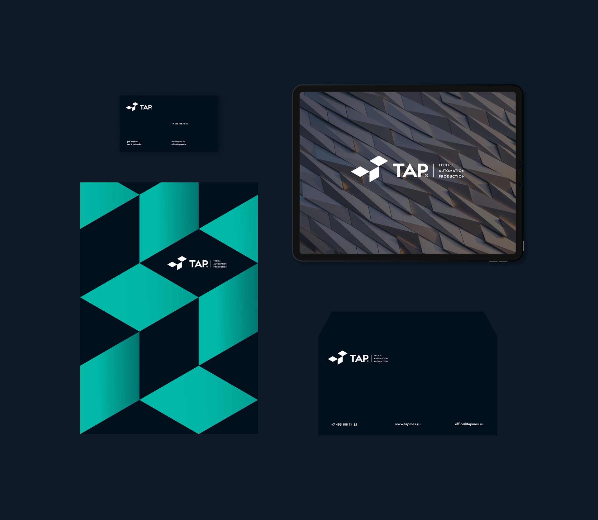
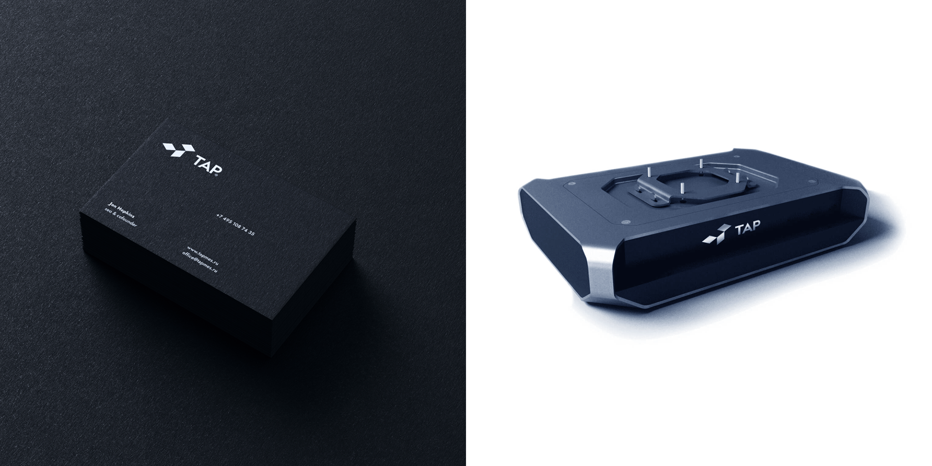
Integrated into hardware, architecture, and offices
From facade architectural signage and industrial server controllers to branded packing tape, office lobby walls, and digital app touchpoints, the identity reflects engineering precision.



Need a logotype for your product?
Send a link to your product or a short note about the brief, stage, and timeline. I’ll reply with the next steps.