Cosmobike
Brand identity for a Barcelona-based electric scooter sharing service.
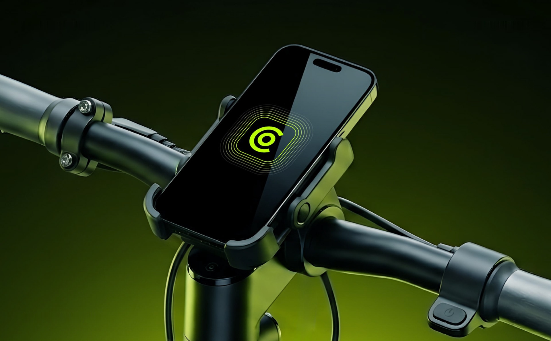
Orbital motion & city access
Cosmobike provides urban electric scooter sharing in Barcelona, designed for quick, flexible daily commuting across busy city streets.
The identity centers on an orbital C-symbol that combines rotation, accessibility, and navigation, maintaining strong visibility across scooter hardware, mobile apps, and street touchpoints.
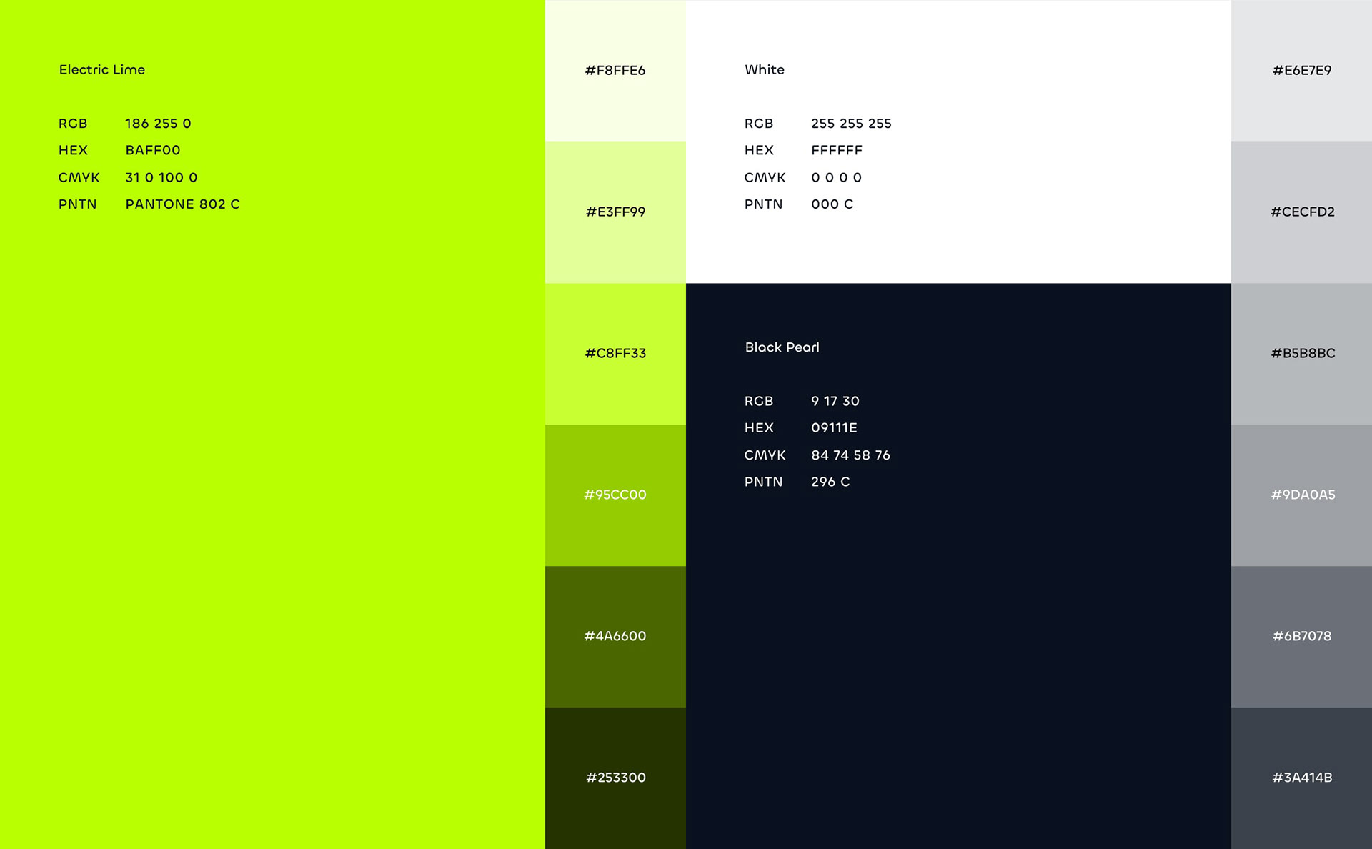
High-contrast Acid Lime and Deep Navy turn narrow scooter frames into recognizable street beacons.
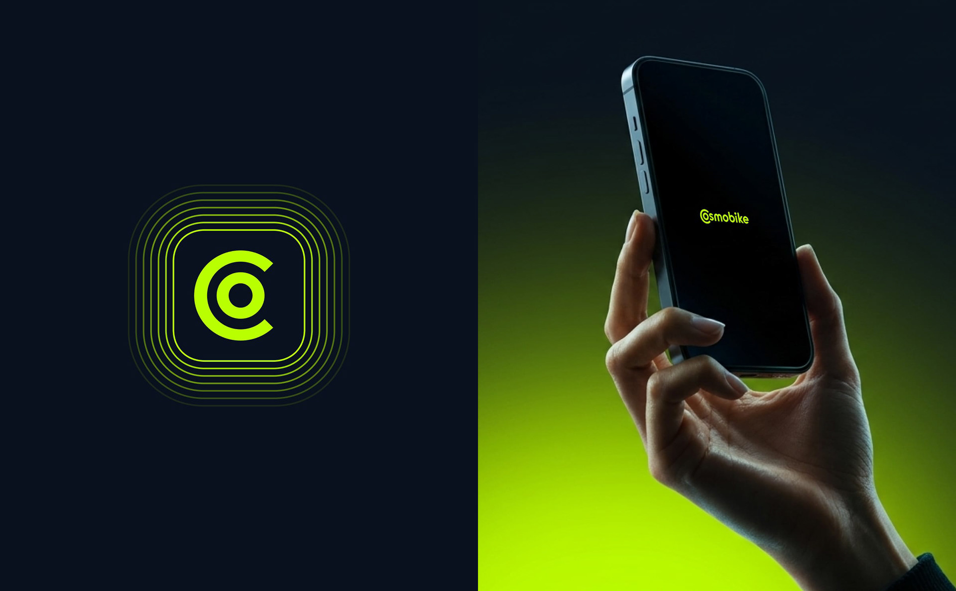
A compact C-orbit mark that stays sharp inside a 60px map pin, app icon, or QR unlock sticker.
Direct layout, color, and typography principles so the team can launch new city zones without guesswork.
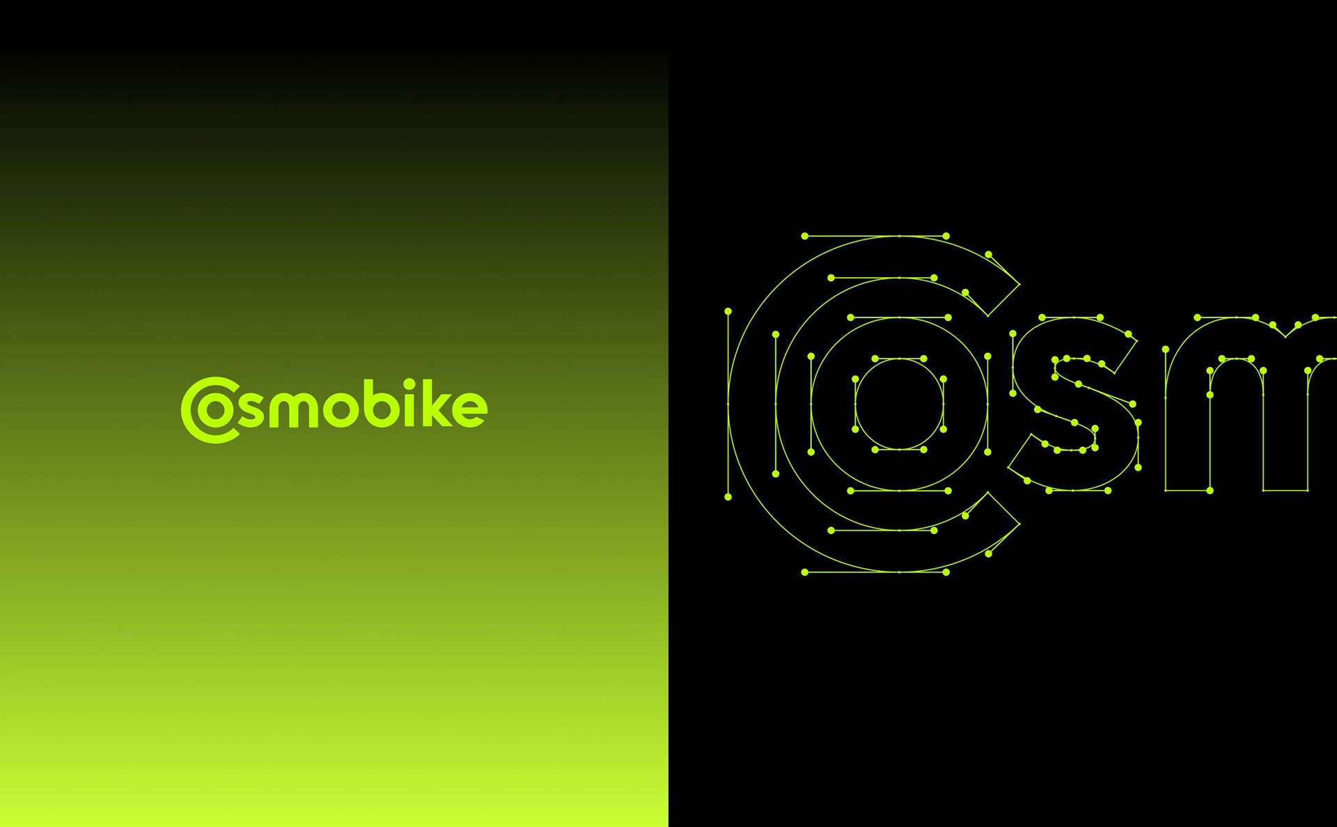
Compact symbol and custom wordmark
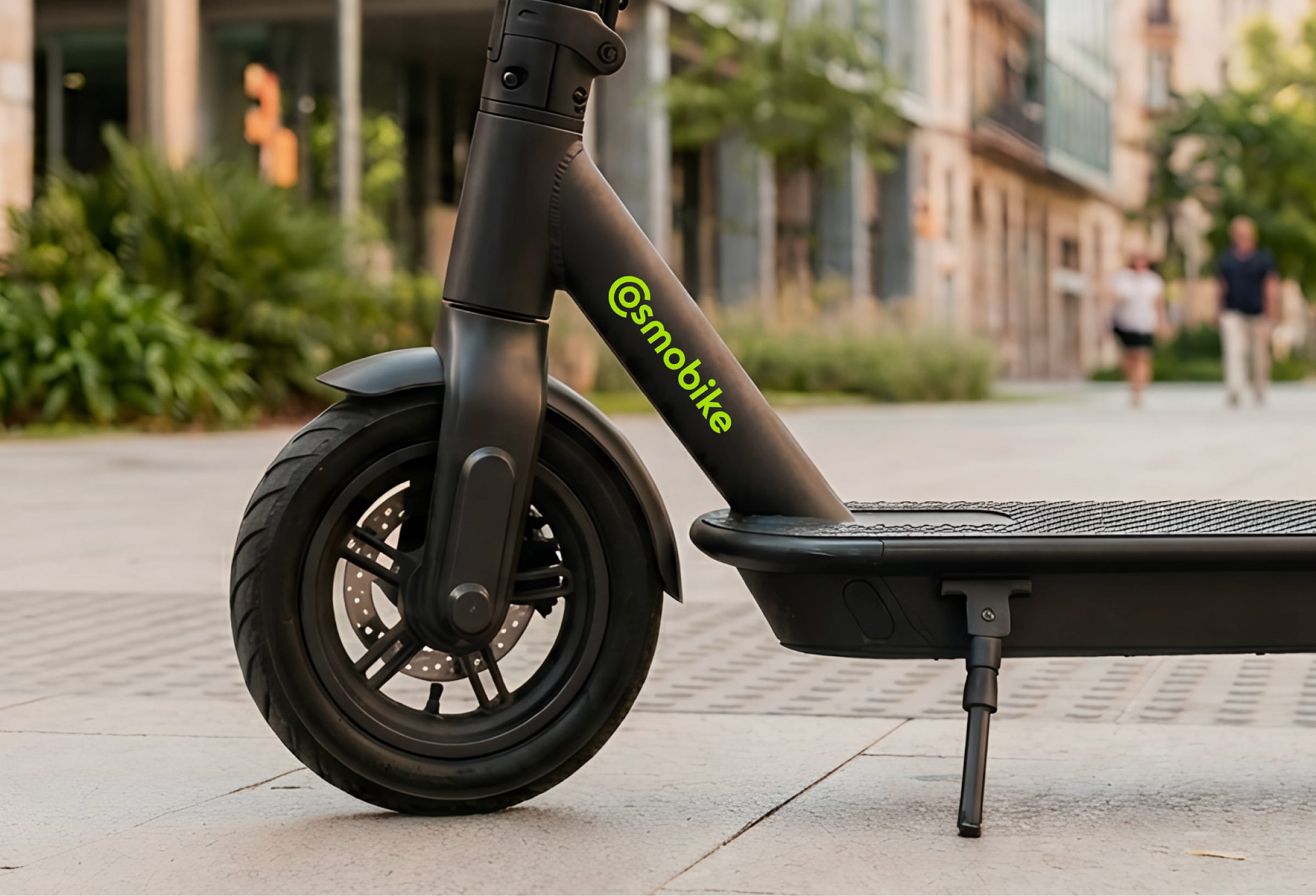
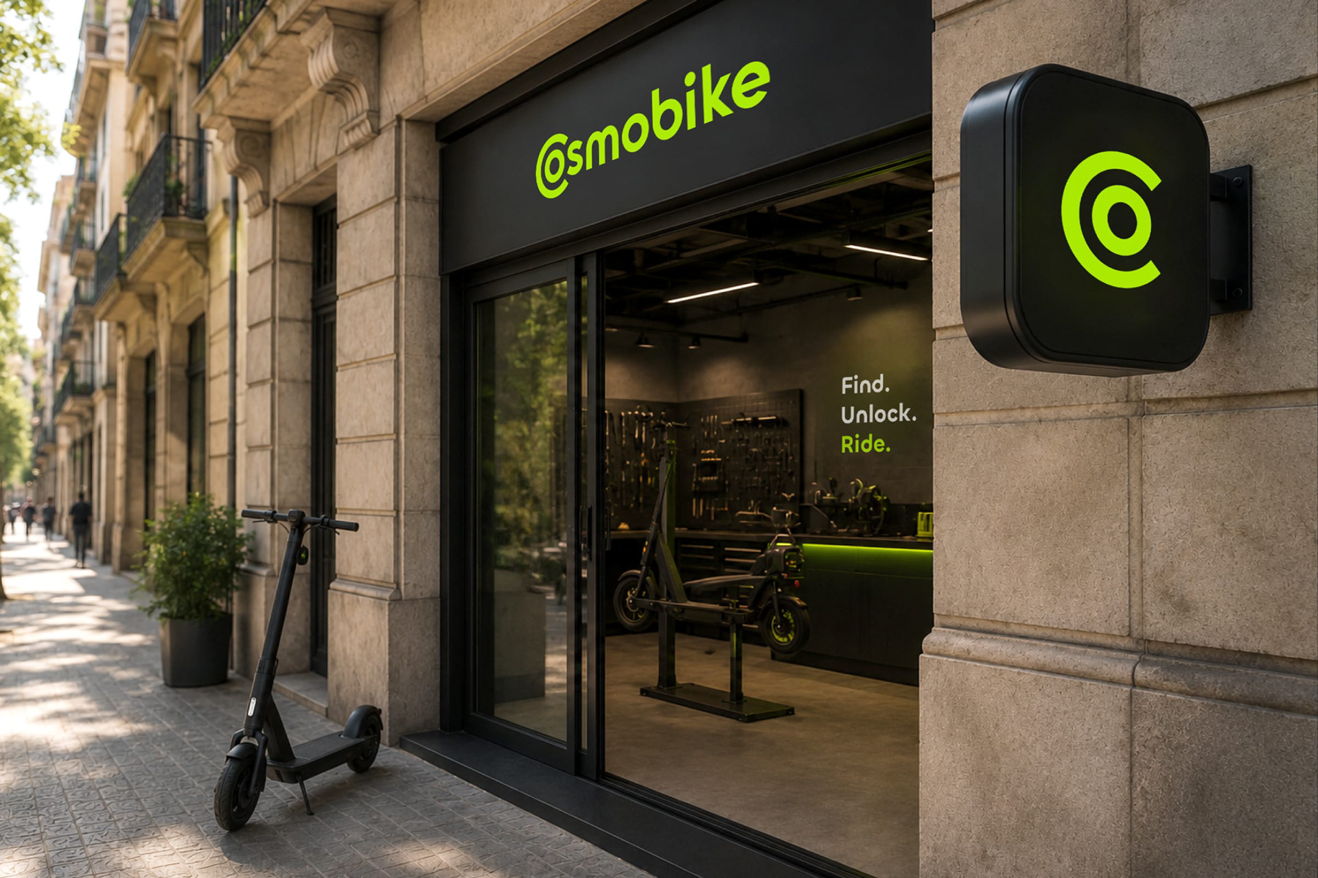
A rounded geometric wordmark paired with a standalone C-orbit monogram that detaches cleanly for app icons, scooter stems, and hardware decals.
High-contrast color and direct typography
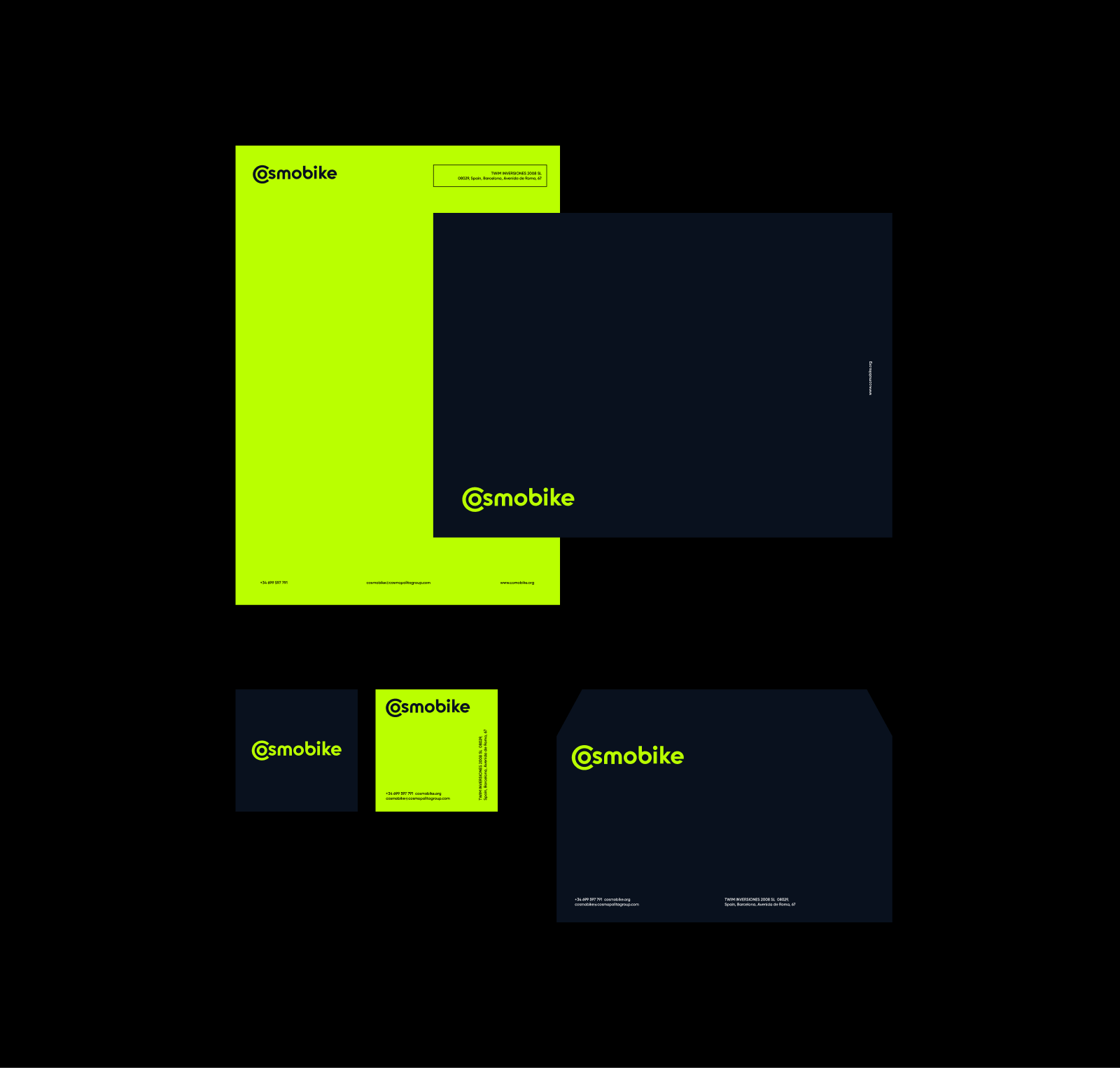
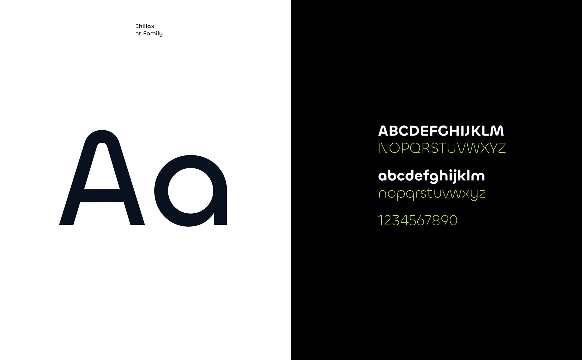
Electric Acid Lime against Deep Navy and crisp White, paired with a clean grotesque typeface so every app screen and street sign reads at a glance.
Orbital curves turn layouts into routes and zones
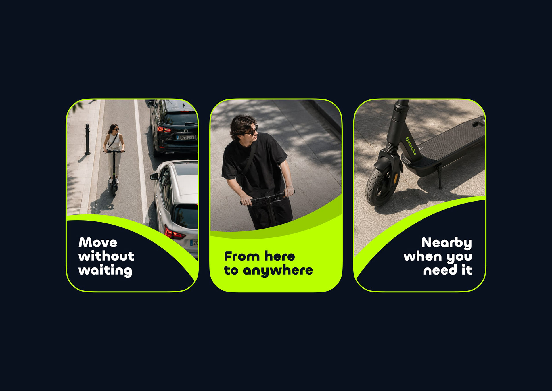
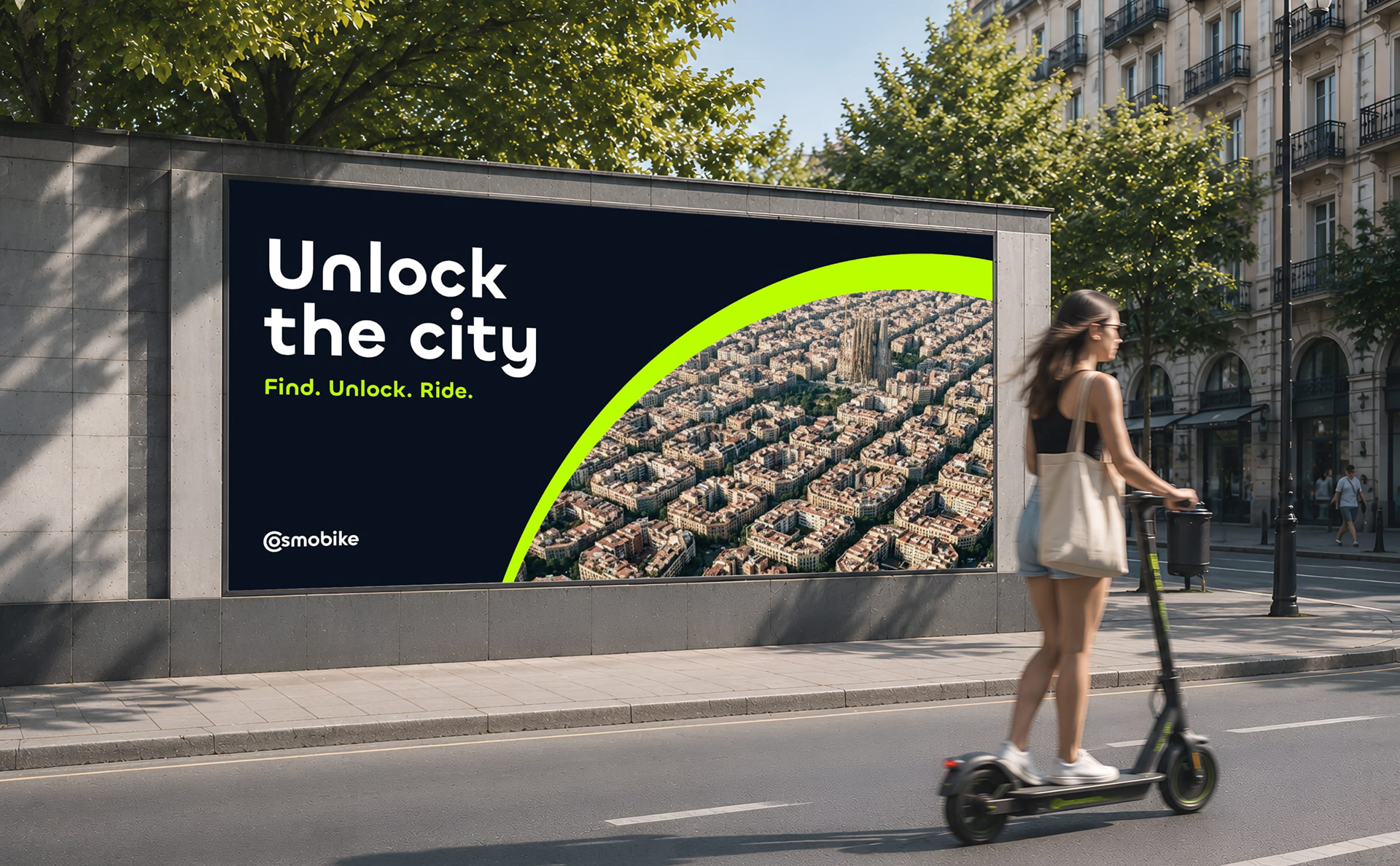
A flexible graphic language derived from the C-monogram for layouts, outdoor communication, and digital touchpoints.
Consistent across fleet, app, and street
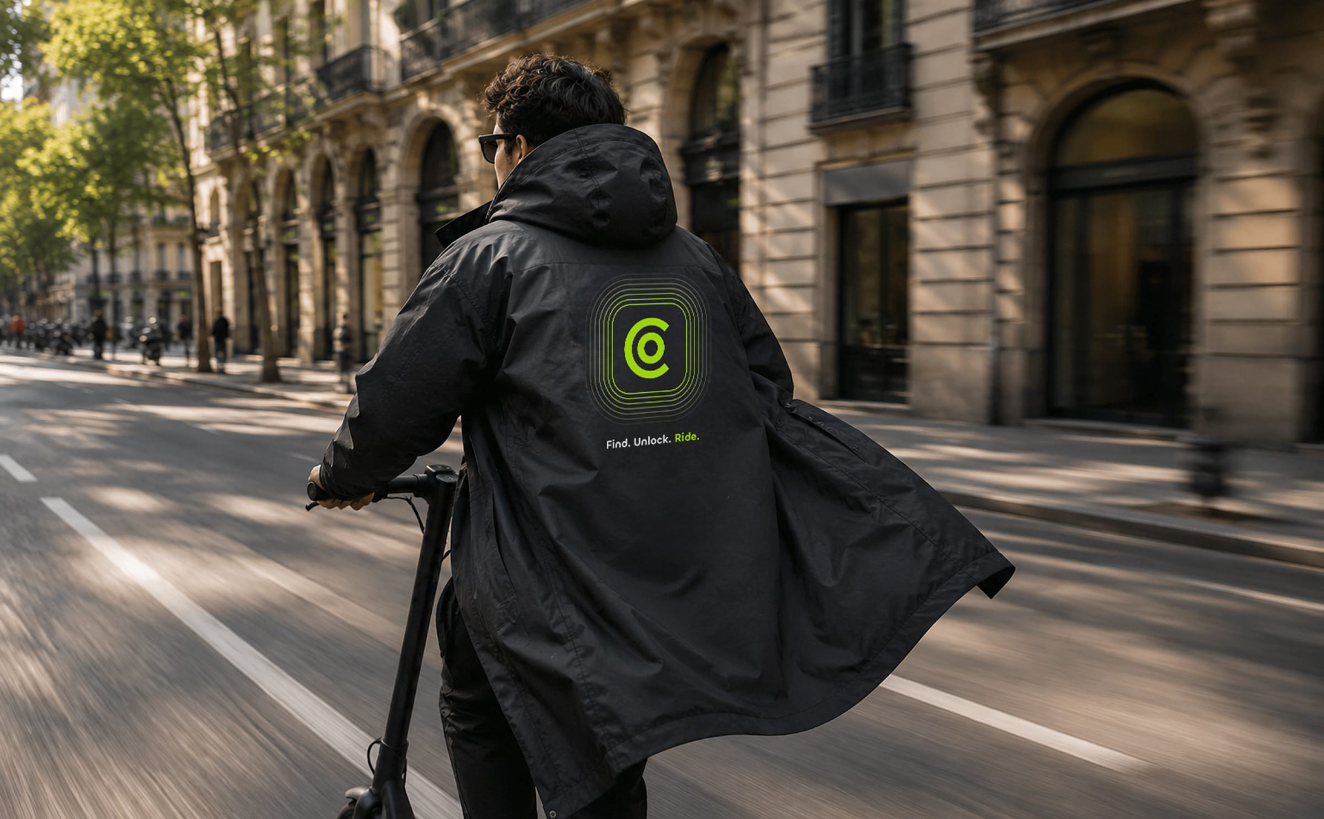
One visual system connecting scooter hardware, rider gear, outdoor posters, city signage, and mobile screens.


Need a logotype for your product?
Send a link to your product or a short note about the brief, stage, and timeline. I’ll reply with the next steps.